Redesigning a legacy app to improve efficiency and engagement
One month to redesign Plurall’s core product, with limited back-end capacity and a migration to Flutter underway. The experience had to support students and teachers, with clear, connected journeys for their different needs, from assigning tasks to completing them and tracking progress.
At a glance
Plurall needed to modernize student activity management while engagement was declining. Research showed that the problem began before students opened an assignment because many did not know it existed or understand its urgency. In one month, I redesigned the complete student flow, connected it with teacher actions and communication, and worked within limited back-end capacity to ship every redesigned screen alongside the migration from native code to Flutter.
- Reduction in time-to-task
- 50%
- Increase in activity completion
- 23%
- App Store rating
- 3.8 → 3.9
The problem started before the assignment
Activity management was one of Plurall's most important features, but its experience and technology had fallen behind. Over six months, analytics showed a 50% decline in activities viewed and a further 23% decline in activities completed. This affected daily use and the value schools perceived in the platform.
Because Plurall is a B2B2C product, the student experience could not be treated in isolation. Teachers decide when and how assignments are introduced, encourage students to complete them, and influence whether a school continues to see value in the product.
- Never viewed
- 8M
- Viewed, not answered
- 1M
Research challenged our first assumption
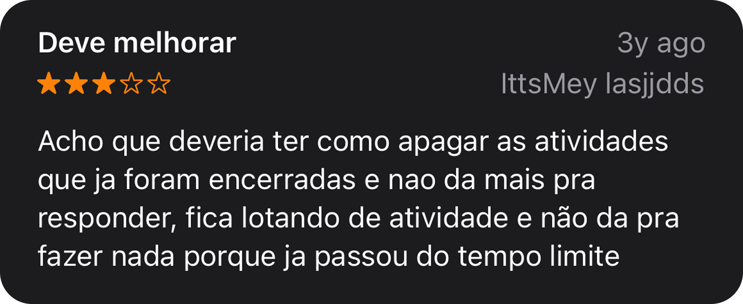
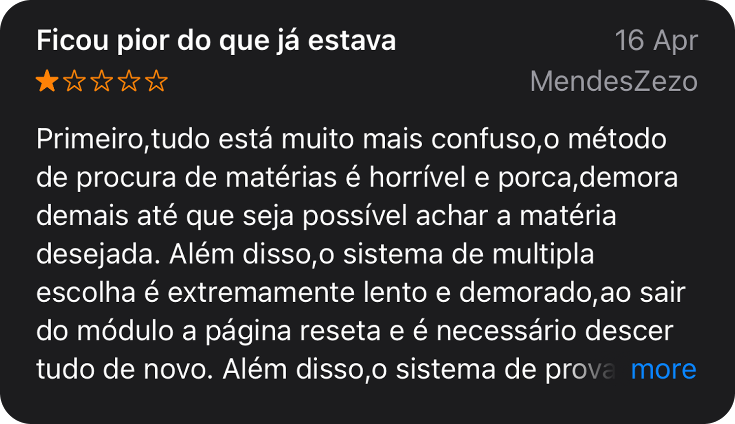
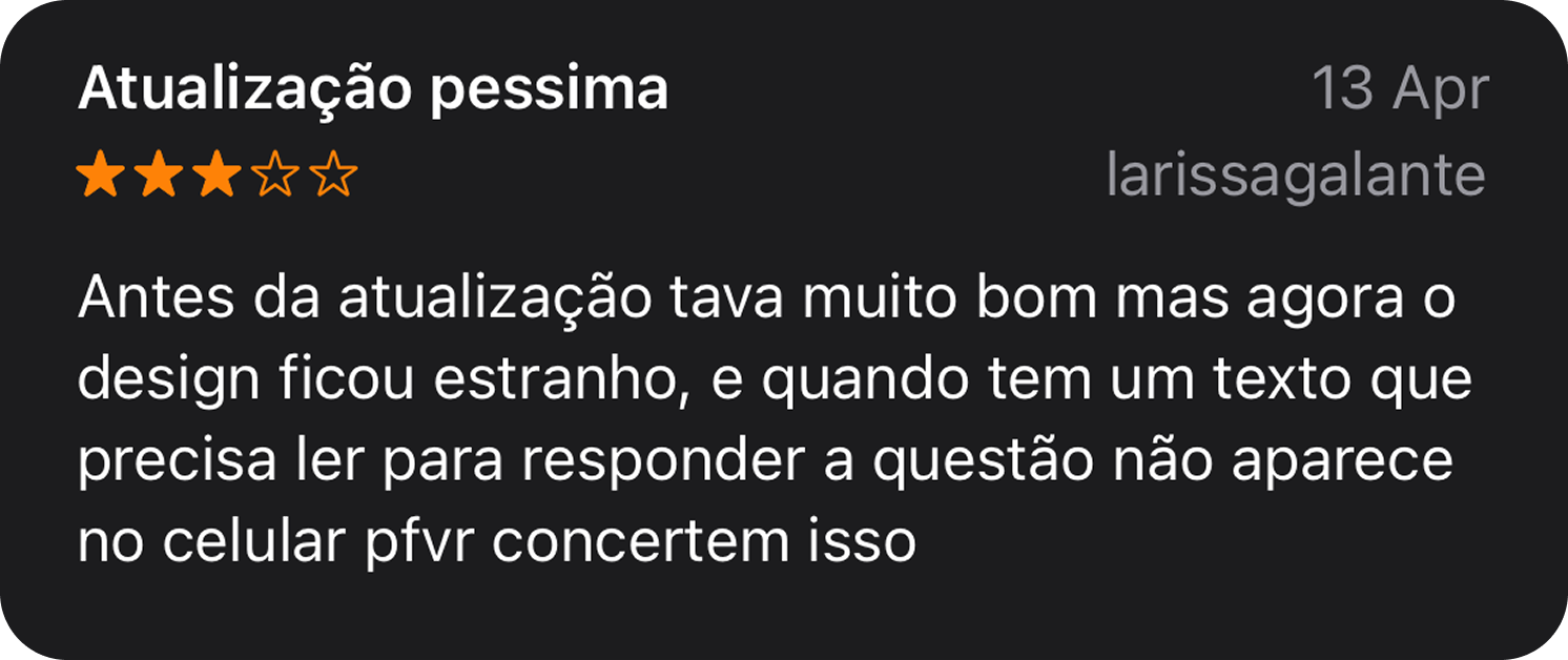
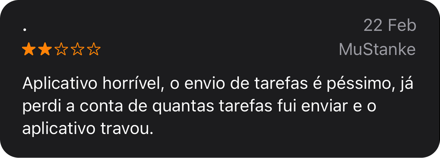
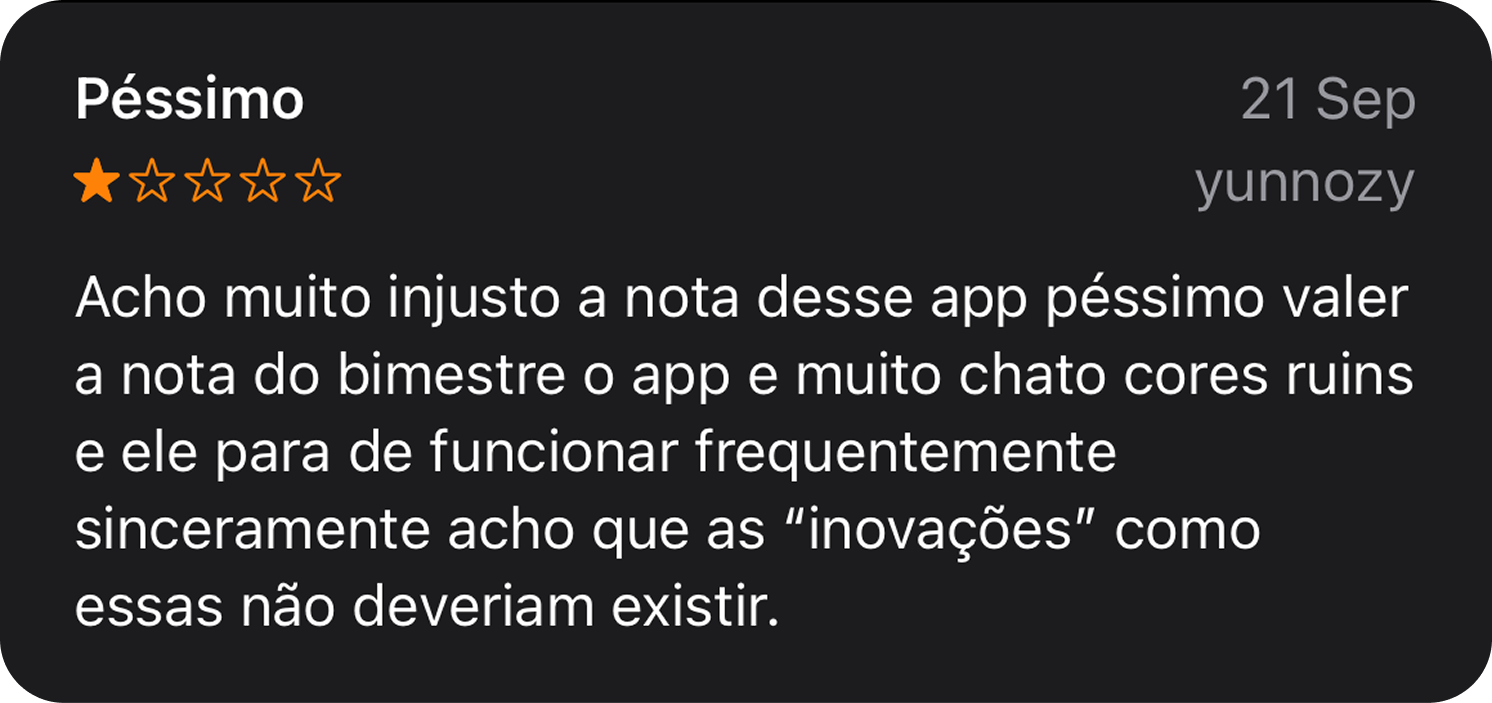
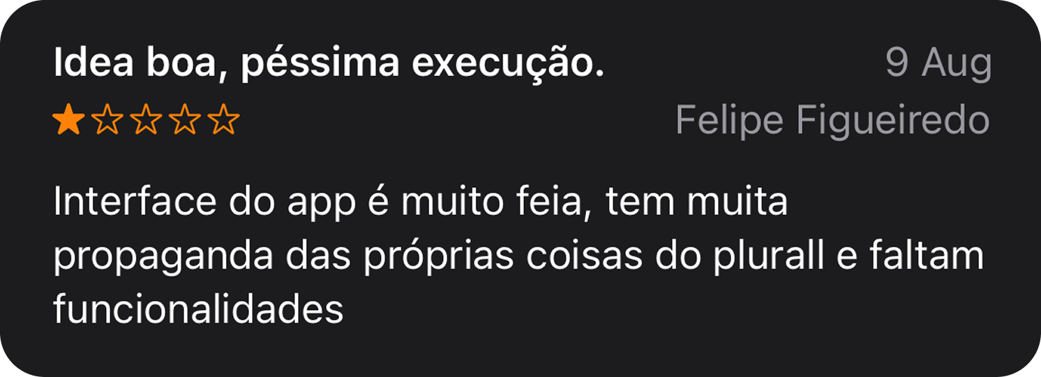
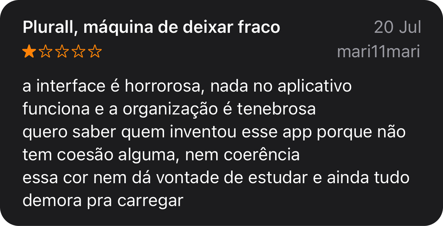
Our initial hypothesis focused on friction while completing assignments. I combined a heuristic evaluation, student and teacher interviews, NPS feedback, App Store reviews, benchmarking, journey mapping, and behavioral data to test it.
The root problem appeared earlier. Students often did not know an assignment existed, could not tell what required attention, or struggled to understand the relationship between subjects, classes, deadlines, and status. In interviews, students also said the interface felt less engaging than products such as Duolingo, reinforcing executive leadership's hypothesis that a more enjoyable, gamified experience could strengthen motivation. Improving the execution flow alone would not reverse the trend.

One experience connected two different journeys
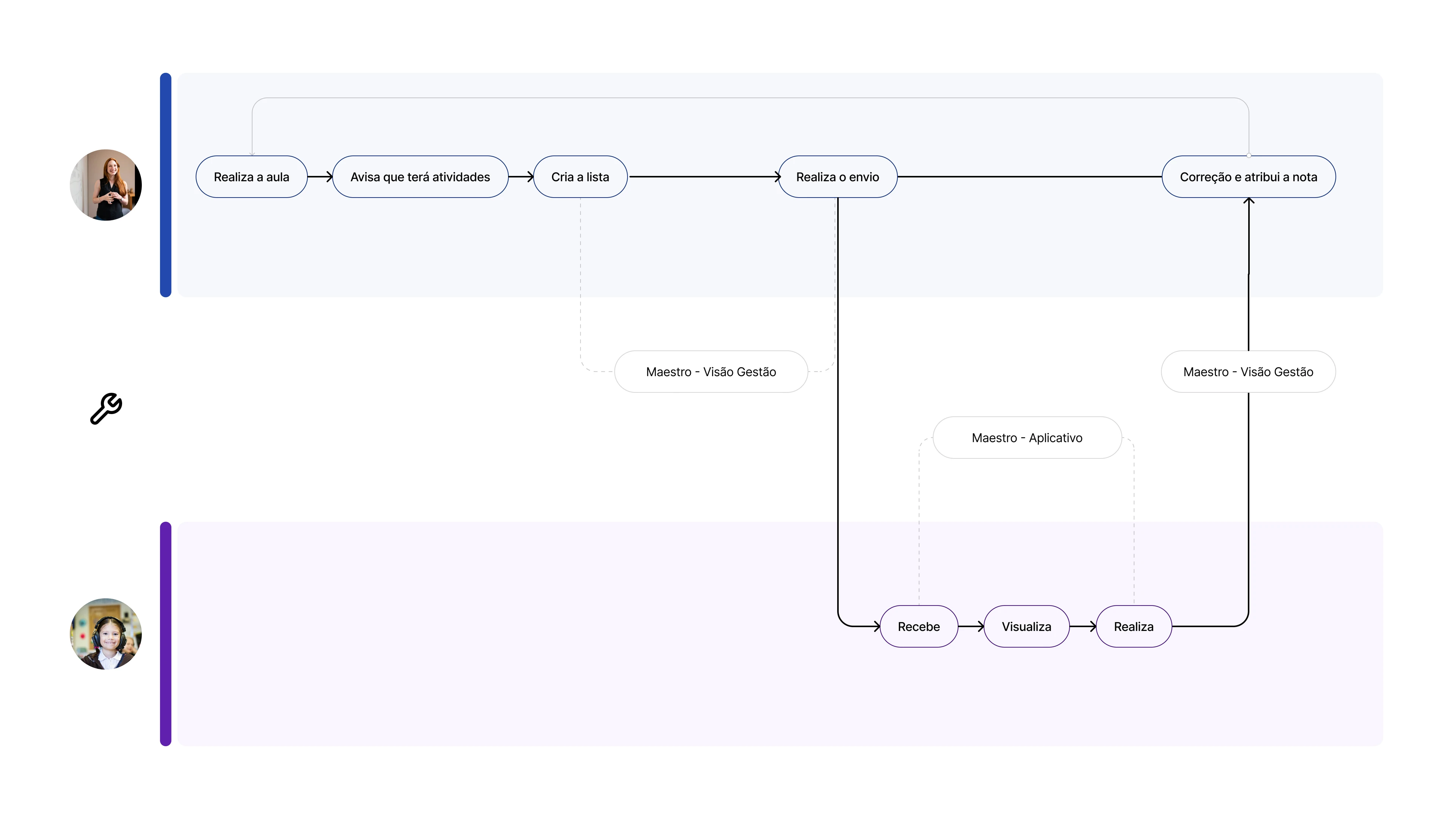
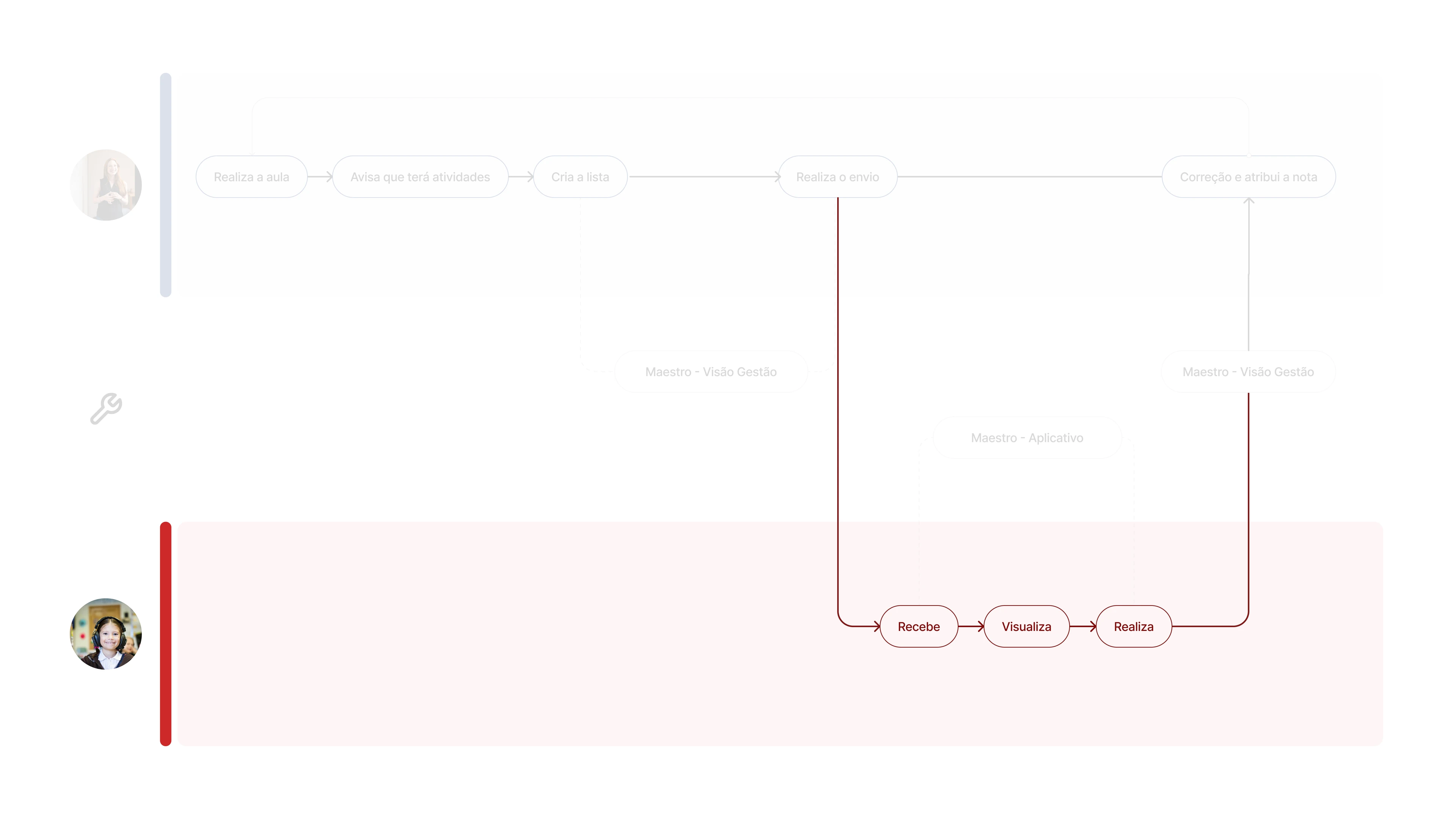
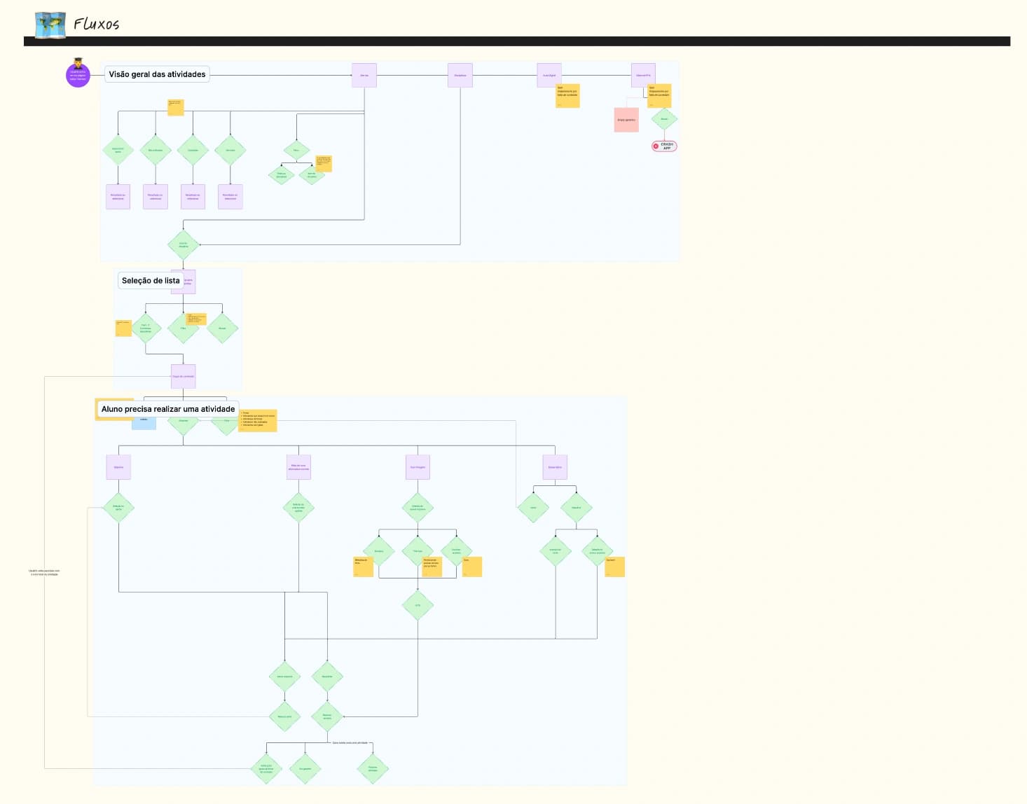
Students and teachers had different goals, but their outcomes depended on each other. Students needed clear priorities and a faster route into their work. Teachers needed visibility into participation and simple ways to bring students back into the experience.
I mapped current and future journeys for both audiences so each decision could support the complete loop from assignment creation and communication to student completion, correction, and feedback.
Ambition had to meet technical reality
We explored a more learning-focused experience inspired by products such as Duolingo. I ran workshops with stakeholders to shape both that longer-term vision and the changes we could deliver now. The concept made assignments feel more motivating through progression, clearer feedback, and playful interaction, but the team did not have the back-end capacity to support it within the project.
Rather than let the larger vision block progress, I worked with Engineering, Product, and business leaders to prioritize the highest-impact changes from our research that could be delivered in the Flutter migration. We focused on front-end structure, interaction, communication, and the points where students were losing context.
Progression, motivation, feedback, and more playful learning patterns.
Modernized navigation, communication, status, and assignment execution.
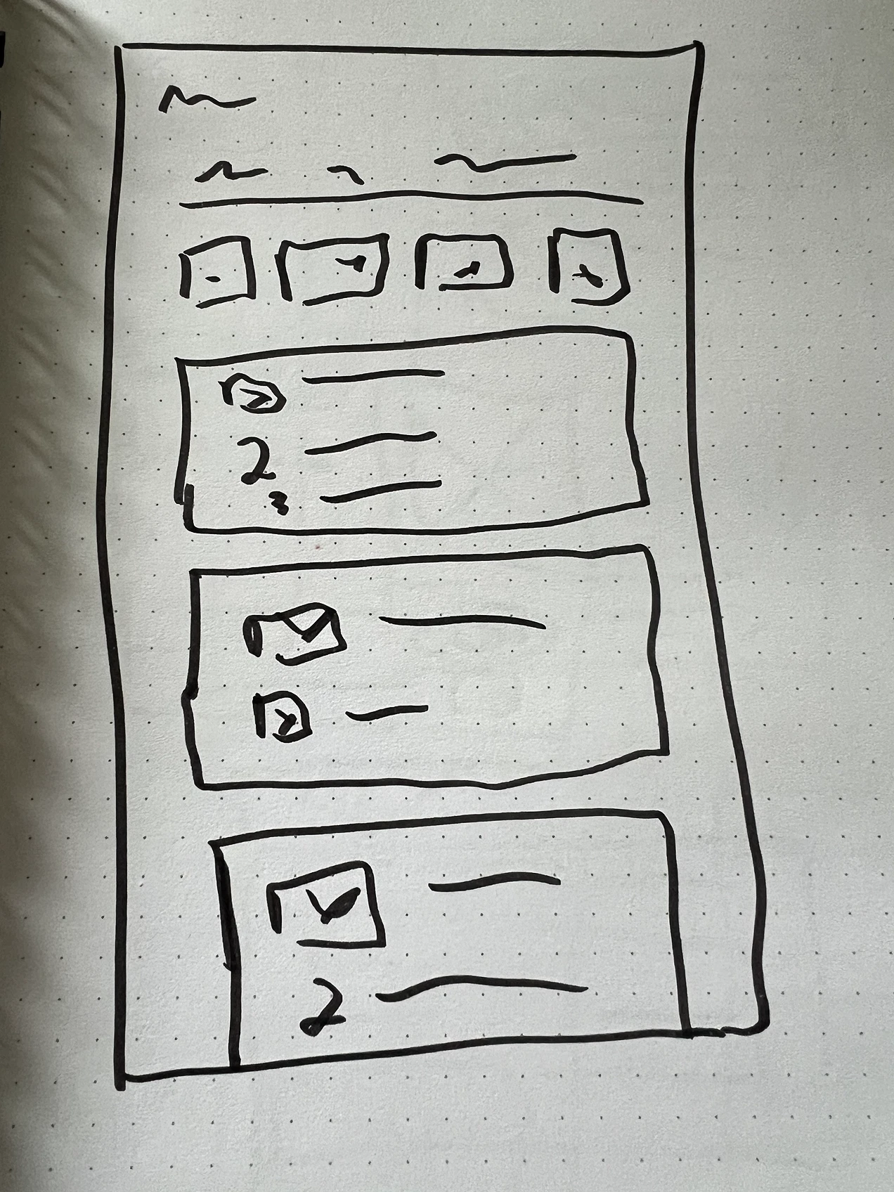
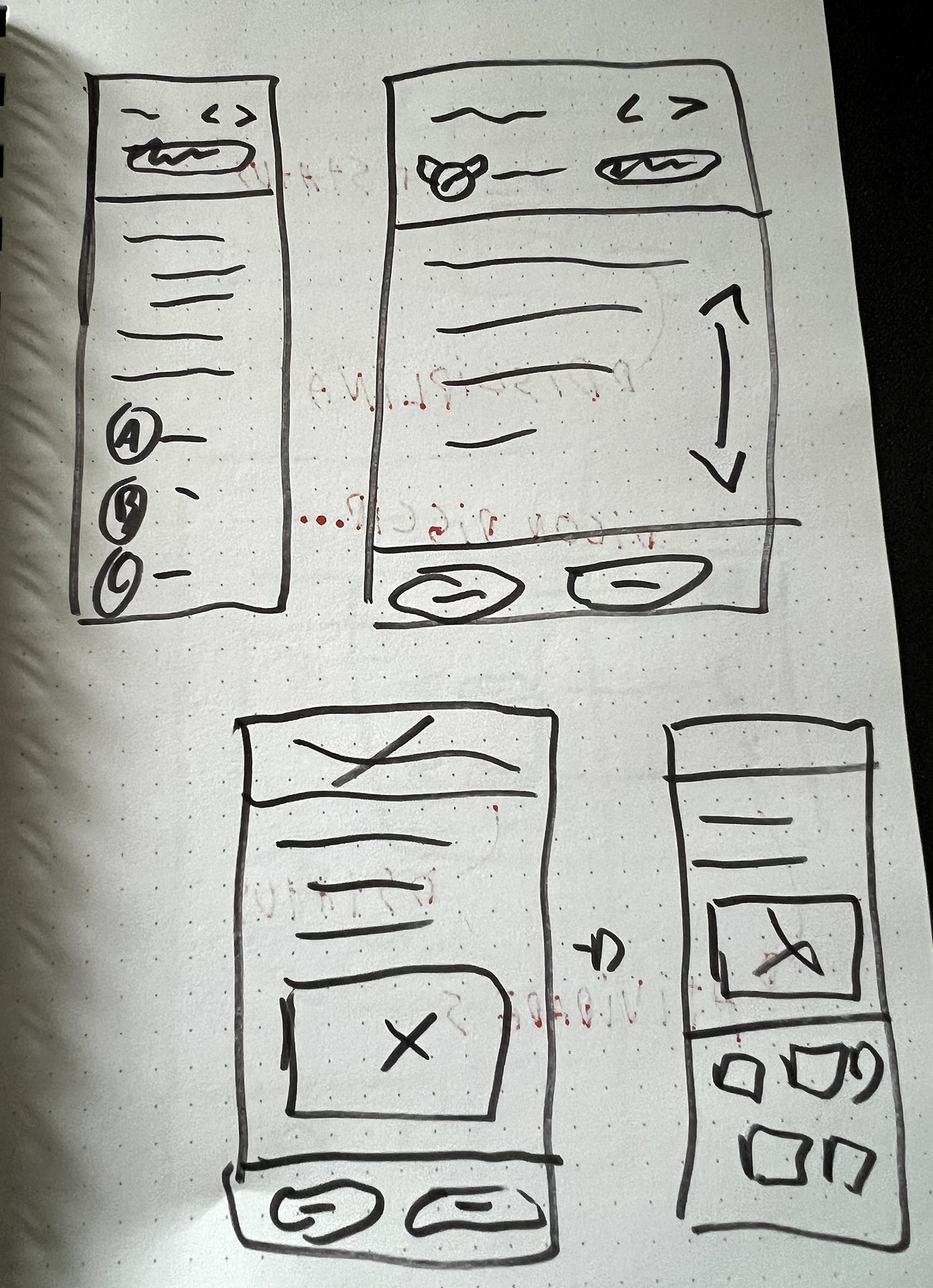
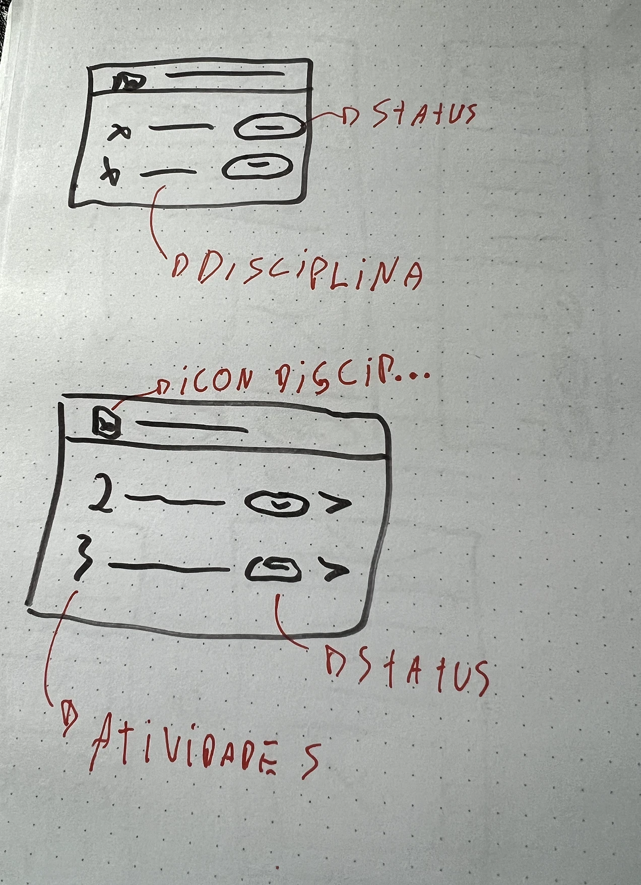
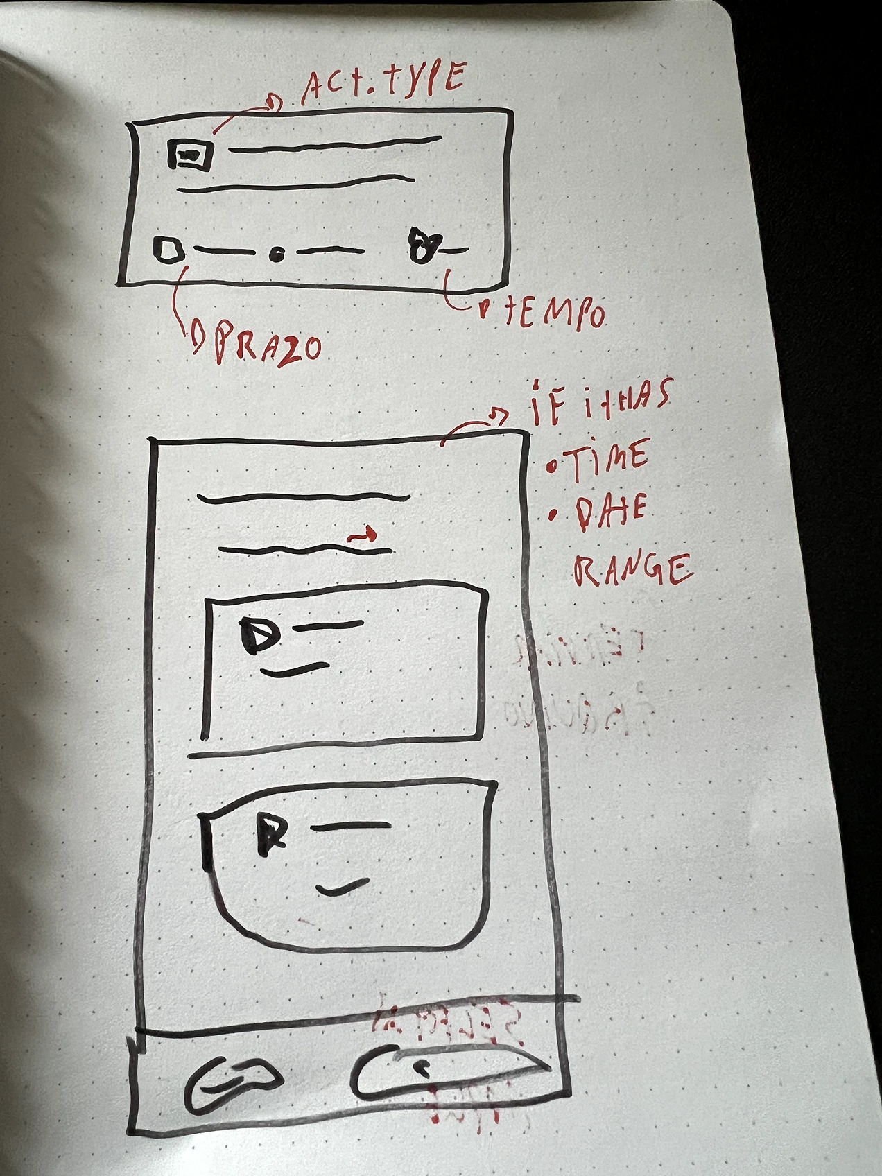
Finding the right assignment became faster
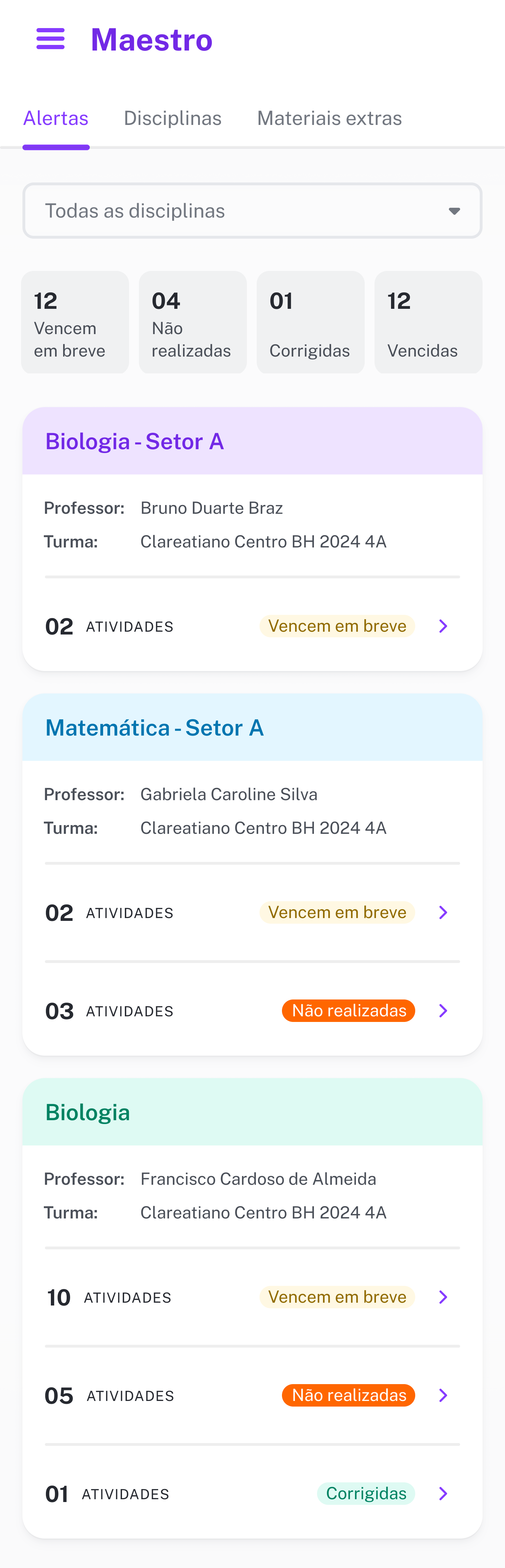
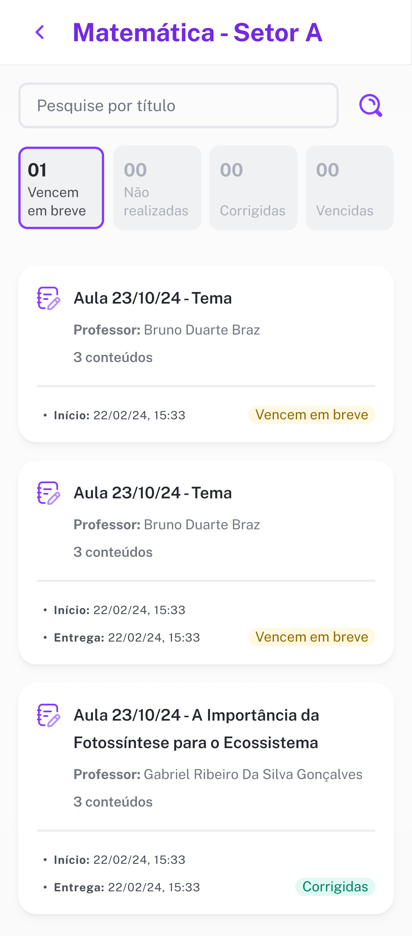
The previous experience required students to move through screens and filters before they could understand what needed attention. We reorganized the dashboard around status and urgency, then connected it to subject-level lists with clearer teacher, class, deadline, and content information. We also gave each subject a consistent color across the experience, helping students recognize it as they moved between the dashboard and activity lists.
Completion became clearer from start to finish
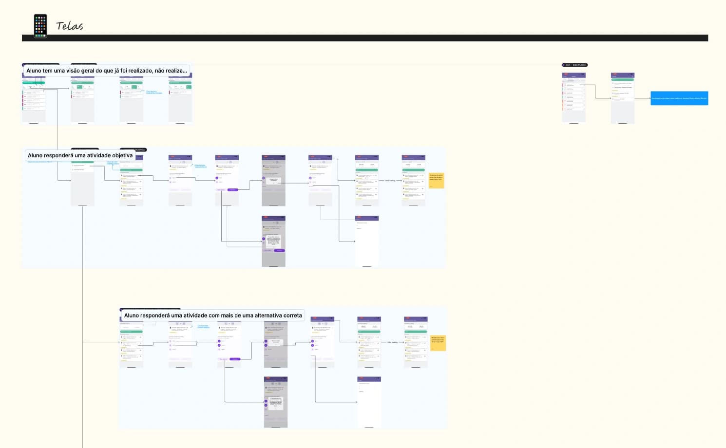
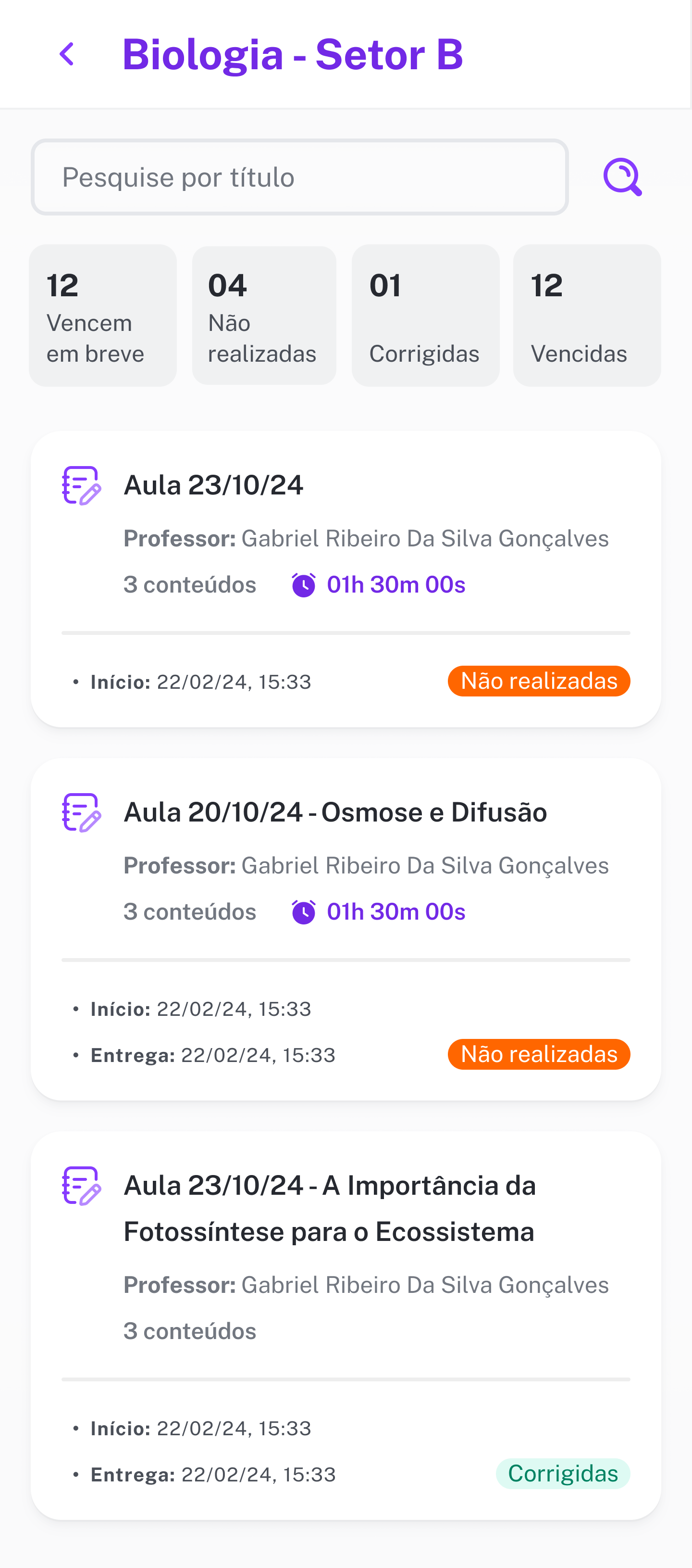
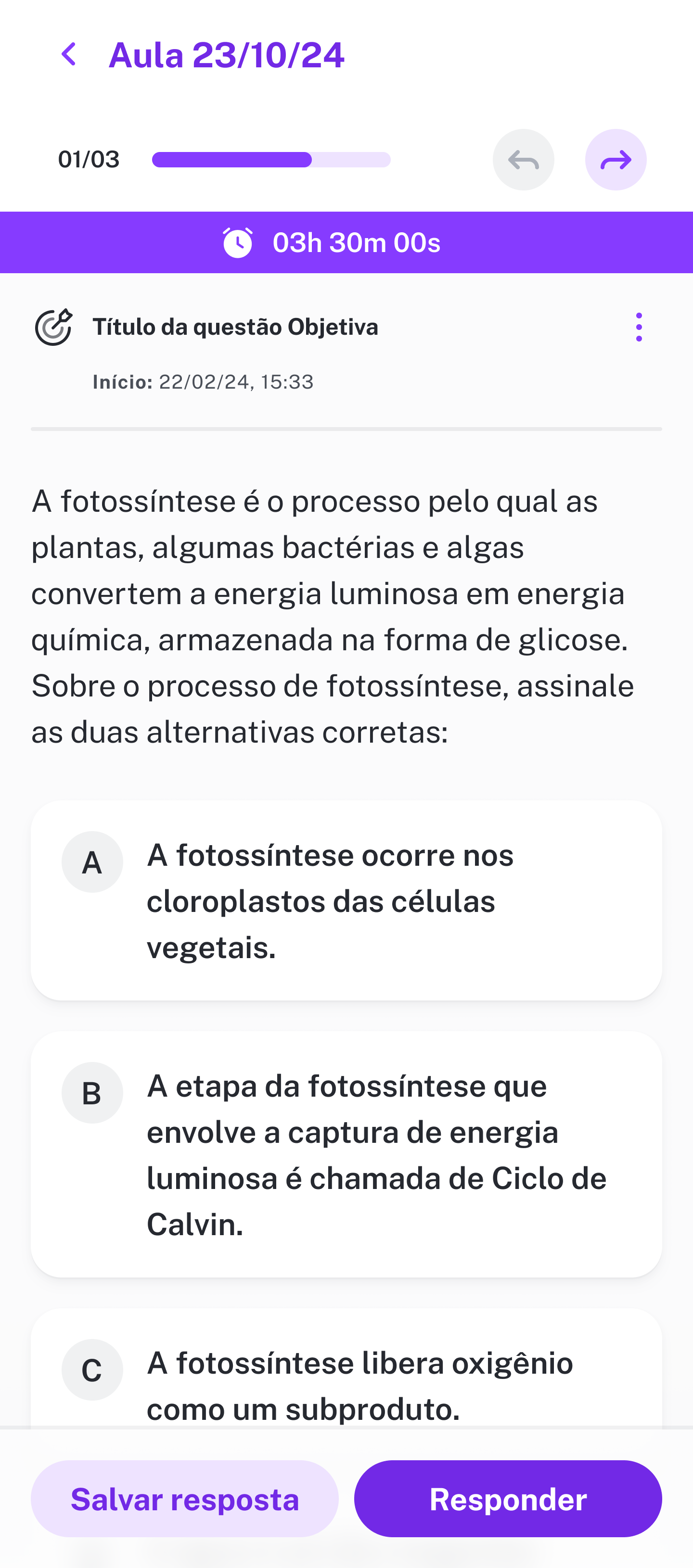
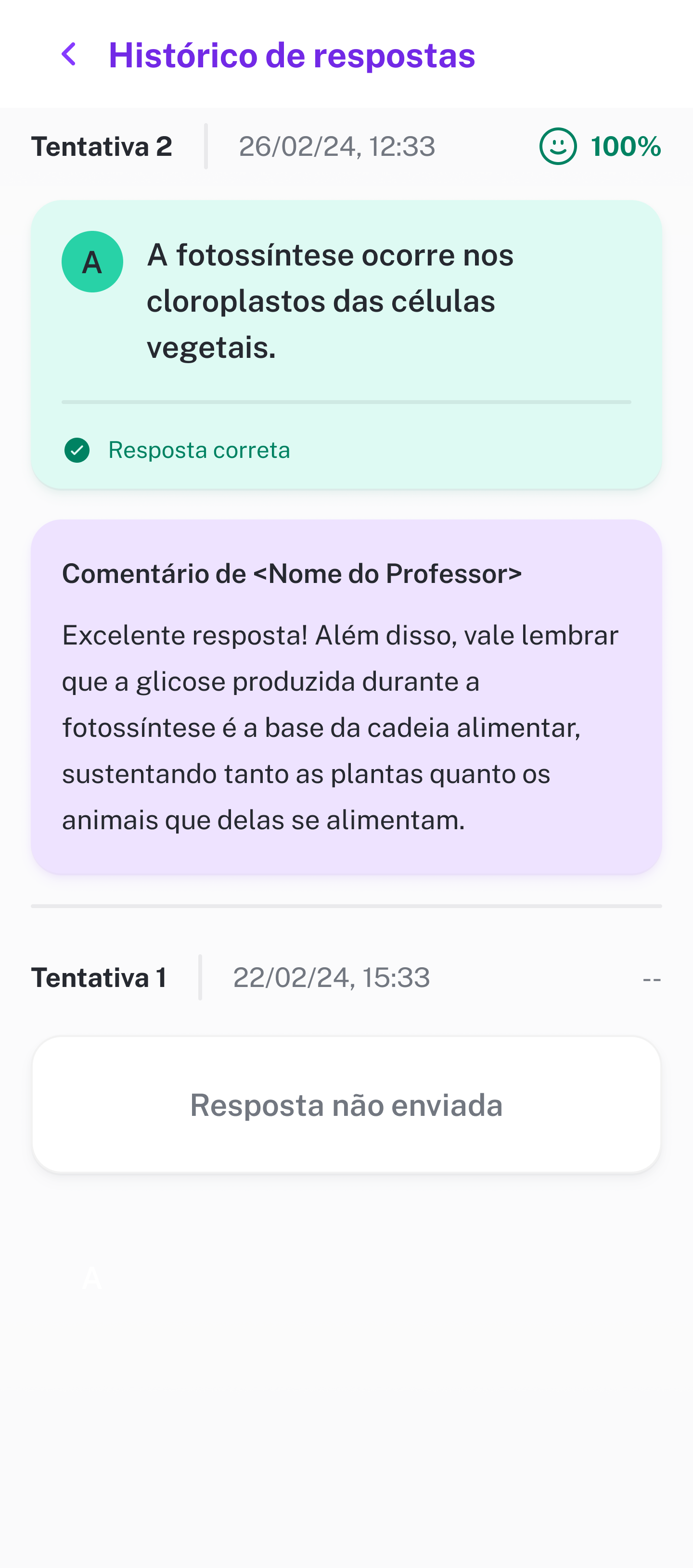
Once students reached an assignment, the redesign established a consistent path through its contents. Progress, time limits, content types, navigation, save and submit actions, results, and teacher feedback became part of the same mental model.
This work modernized the full activity flow rather than a single screen. Every redesigned screen represented in the case was shipped as part of the new Flutter experience.

Communication brought students back
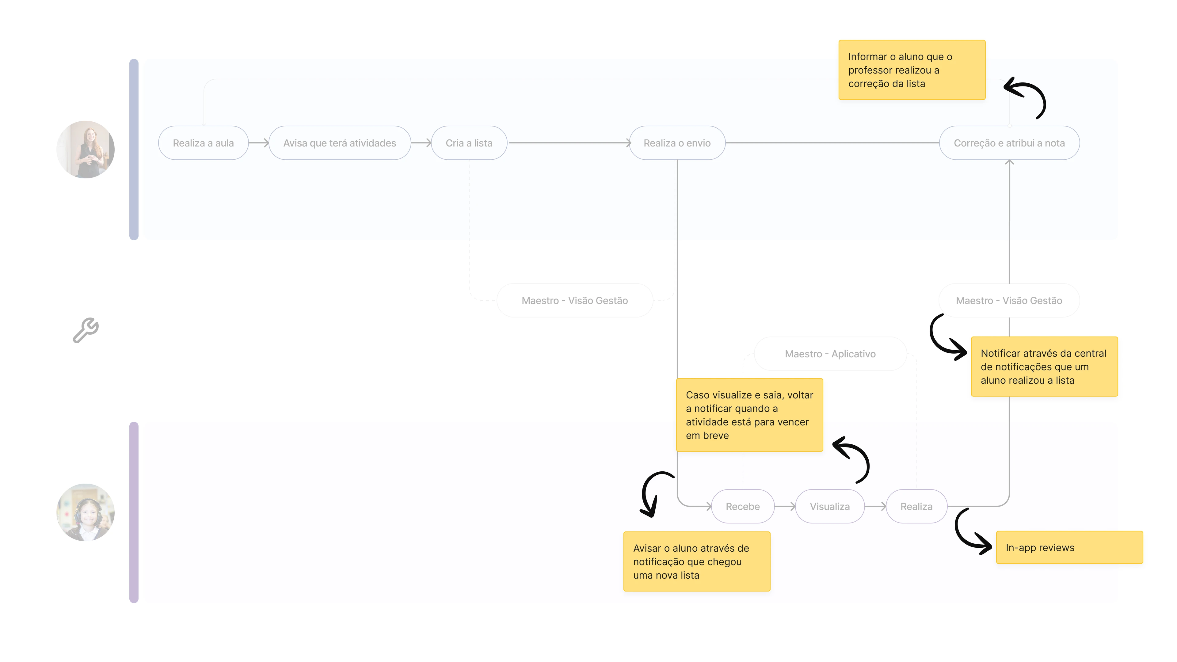
Better organization inside the app would not help students who never returned to it. We introduced native push notifications and email communication around new assignments, approaching deadlines, and corrected work so urgency could reach students outside the product.
We also improved teacher-facing prompts and partnered with Marketing on training materials. Teachers needed to understand the change, encourage students to use it, and feel that they were part of the new experience rather than simply receiving an updated interface.



Teachers gained better visibility
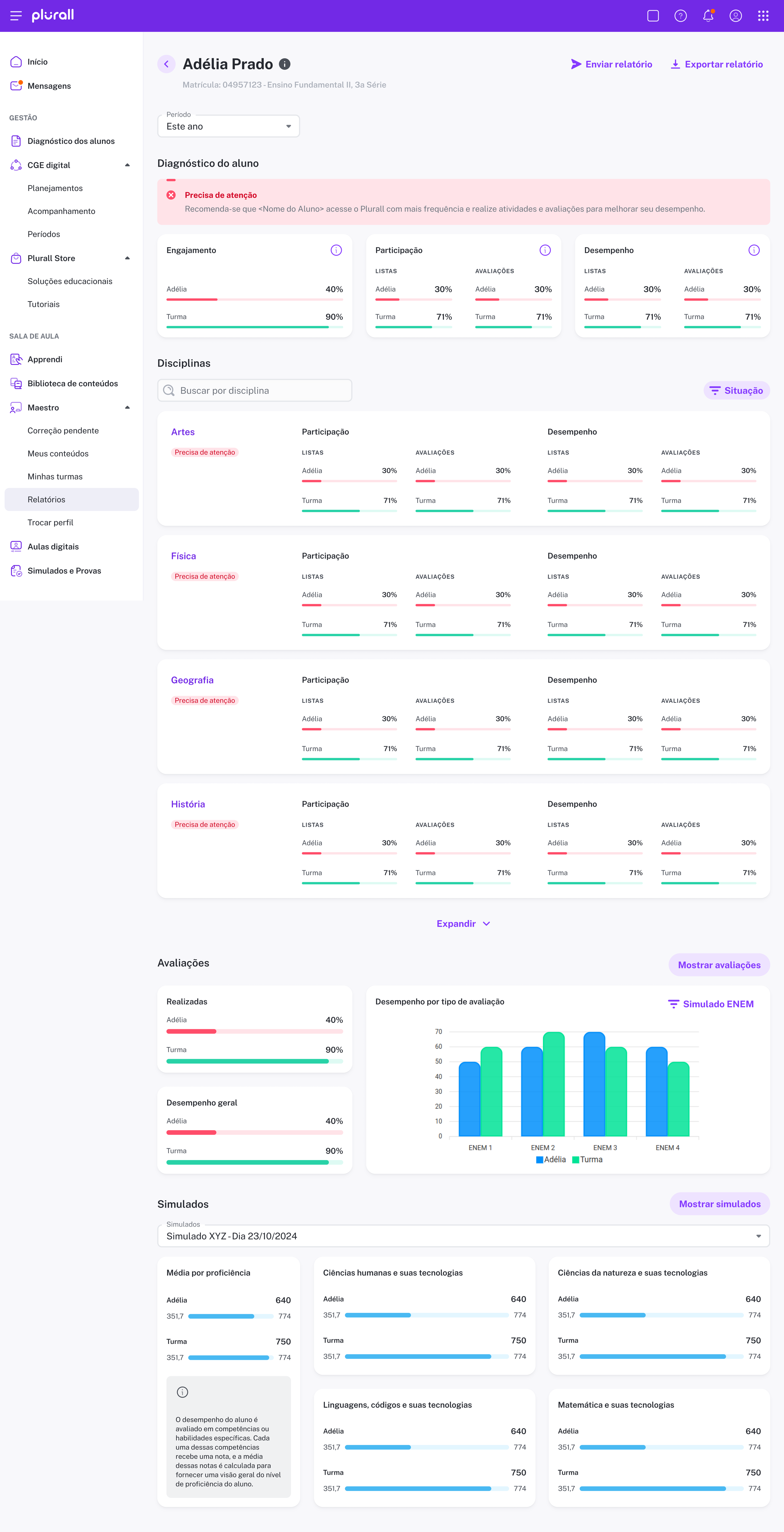
Teacher improvements supported the same student outcome from the other side of the journey. Diagnostics helped teachers identify participation and performance gaps, compare a student with their class, and understand where encouragement or correction was needed.School directors could see patterns across grades, while teachers could use the dashboard to discuss a student's progress with parents. We also sent teachers in-product alerts when students completed an assignment, so they could correct it and provide feedback.
This reinforced an important product principle for Plurall. Student engagement depends not only on a student-facing interface, but also on giving teachers the information and confidence to guide the behavior around it.
The new experience reversed the trend
Three months after launch, activity completion had increased by 23%. In usability testing, the time required to reach and start an assignment fell from 8.9 seconds to 4 seconds, an approximately 50% reduction. The App Store rating increased from 3.8 to 3.9.
The team also completed the migration from native iOS and Android code to Flutter, and every redesigned screen in the shipped scope reached production. The results showed that addressing discovery, urgency, communication, and execution as one connected journey could change the product's downward trajectory.
- Reduction in time-to-task
- 50%
- Increase in activity completion
- 23%
- App Store rating
- 3.8 → 3.9
The obvious symptom was not the root problem
This project reinforced the value of looking earlier in a journey than the point where a problem becomes visible. Students were struggling to complete assignments, but the decisive friction happened before execution, when they were trying to discover, understand, and prioritize their work.
It also showed how to preserve ambition while working within real constraints. We kept a broader learning vision alive, but sequenced a foundation that Engineering could deliver and that students, teachers, schools, and the business could benefit from immediately.